First Impressions Of Your Website Are Crucial
THINK OF YOUR WEBSITE AS A PERSON – YOU TO BE EXACT. FIRST IMPRESSIONS ARE EVERYTHING.
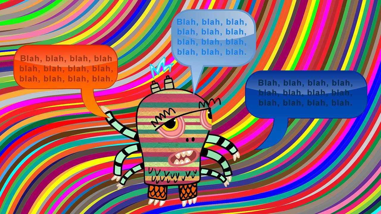
Are you squinting looking at the picture above? There is simply too much going on. Visitors may leave before they even get a chance to find out more about you and what you do just because your website design is too distracting. Too many colors – too may different font styles – too much text – too much going on all around!
1. Written Content
The written content (verbiage) is the most important part of your website – this is what your visitors and Google bots will read. You want your verbiage to sound like you know what you are talking about (because you do!) and to the point. If you start rambling you may risk losing people’s interest and they will leave.
2. Website Design – Keep It Simple
I’m not telling you what to do and how to design your website, but imagine you are meeting a potential new client and you are wearing all your your most colorful clothes AND all accessories. They won’t know where to look first and likely not hear a word you say…
That said – most of your website visitors will come from some sort of a mobile device or giant 5K desktop computer screen. Ergo – your website must load flawlessly on every device and lead visitors to what they are looking for with one click.
So, keep it simple! Which brings me to my last point:
3. Accent Colors and Images
Two accent colors and a few well-selected images are usually all you need to convey your message.
Pick one complimentary color (from your logo, perhaps?) so when visitors see that color they know it’s a link and it will lead them somewhere important.
Sometimes you just need an outside perspective. I am happy to evaluate your website at no charge and let you know what can be done to improve both design and search engine visibility in a reasonable amount of time and at an affordable price.

